I was truly excited for this assignment. The task was to take inspiration from the film “Moxie” ( which I loved ) and then to go and create our own campaign about something we’re passionate about! It involves creating four outputs including the video. To be honest, I found myself lost with ideas for a while. For the first time, I struggled to come up with something I cared enough about to make a campaign out of. I made a list of all the terrible things out there like knife crime, poverty in a world with billionaires, global warning etc etc. But looking back at my past artwork In Human Trafficking, FMG and at todays current problems, I realise that the world truly lacks empathy and the cause for it all is apathy. And if you look back at a time before we all saw the world this way, you’ll realise that you were proprably a kid. That became my intention. My campaigns base was to act as awareness for adults not to lose that innocence and humanity that dulls the older we become.

I immediately sought to make moodboards for my mock zine that we were asked to produce. I looked into artists like Banksy, photographer Johnathon Hobin, Margaret keene. I also looked into other forms of art like “War Horse” and “The Boy In The Striped Pajamas” novels. All of which are known to shock and make any adult remember what it meant to be a kid as we briefly see the world from a child’s eyes again. I then looked into actions that we see everyday on media that we have all become numb to. Such as war photos, protests on the rights for life, for choice and for decisions to get made etc. Creating moodboards and looking into all this imagery really fired my passion even more as I looked into everything that has been happening in the past two years and I realise, that we need this campaign more than ever. However, I still needed a name and a direct aesthetic….

It had to be Margaret keene. I definitely felt inspired by the movie “Big eyes” and the idea of the eyes being the windows to the soul. It was interesting how as children the wider our eyes seem to be and the more exposed the windows to our soul are. And the older we get, the narrower our eyes become. Its a cheesy thought but one that makes sense.
The next step was to look for a name, I looked up word associations for childlike innocence and immediately “Wide Eyed” came up. The term means ” Too willing to believe and admire what you see or are told”. It was in seeing the movie and coming up with the name where I had the bizarre idea to visually and truly make everyone wide eyed.
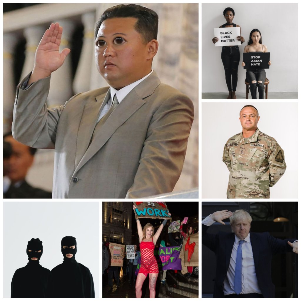
My plan at this point, was to create an AR filter that creates a sort of baby face to whatever face you point at. The intention was to recreate Margaret keenes big eyes reverse camera. So on a normal day in London if you see a passer by getting arrested, you can take the opportunity to use the wide eyed filter. And with that idea in mind, I became obsessed with the idea of photoshopping wide eyes on to anyone that I thought needed it. Such as Boris, Kim jong- un, robbers, protestors, soldiers etc. I thought it was hilarious and adorable seeing wide eyes on figures you wouldn’t imagine were ever really innocent. And so that became my aesthetic for the rest of my outputs.
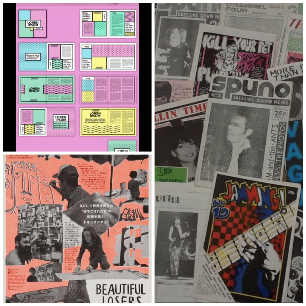
As I was researching zines, I looked into the links sent by our professor. I was introduced to something called a “Fanzine” and I thought they were fascinating. From the print, to the colour and to the general layout, I loved it. It screamed 80s Britain and I knew that the black and white collage style with a sparks of bright colours here and there was the style I’d use. Colour wise, the plan was to use pale pastel colours such as blue, pink and yellow symbolising a calm and happy world. I’ve never made a zine before, so therefore I felt excited to try something new and to expand my output knowledge beyond posters and insta posts.
For the first time, I began looking into zines and what it means. I learned that zines are basically a simple way to express what a creative cares about in the form of a few colours and imagery, It’s like storytelling but in a creative/visual way. Just knowing that helped take the pressure off, it felt like a passion project if anything. I was just expressing what I cared about in a cool and personal way, I spoke to people close to me about what keeps them in touch in the more innocent part of themselves and I got four brilliant answers in return and none of what I expected.
I even found myself taking many days trips to London with my partner so that I could do more research about what people see everyday. I saw “Spencer ” billboards everywhere, Borris Johnson’s latest news reports on his lack of response to the Omicron variant, people in the trainststation getting ready to go to the Cop26 conference protest in Scotland, and I even saw a person getting arrested for attempting to rob a store. All in a days work which immediately helped me fill my first zine.
Unfortunately for the prototype, the print didn’t turn out as well as I’d hoped. With the goal not to be last minute, I arrived early in the digital media workshop to get my work printed A2 and in premium quality. I remembered that I needed to send the doc early so that the technicians would print on time. However, that day of all days the mailing system ( where you export the pdf ) decided to shut down and it wasn’t until two hours later when I got told that I should just email my doc on outlook instead. Worse yet, I forgot to double check my doc before printing, which meant that my final print had a bunch of very visible spelling mistakes in it. Embarrassing… but It did teach me to always double check my work before printing and to never rely on photoshop.
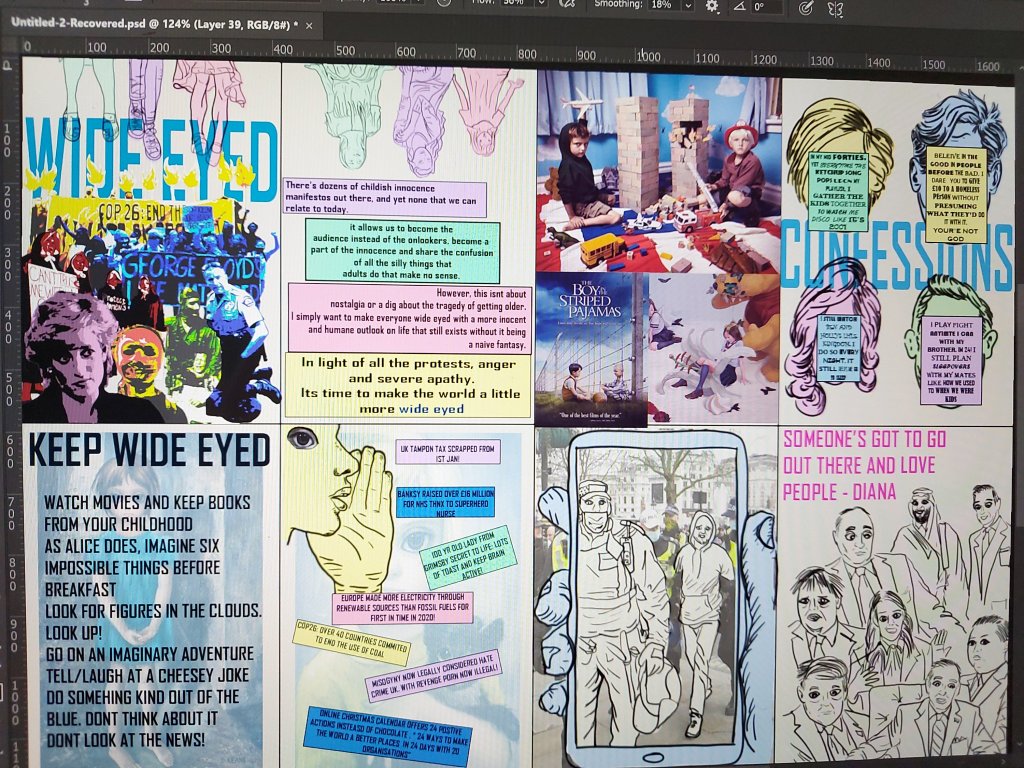
I was quite pleased with the overall aesthetic and the bits of text that I came up with in the end. And after receiving my feedback, I saw that there were quite a few routes I could take in terms of outputs. I decided not to be too predictable by making this a fine art project ( sculptures, drawings etc) but I did want to show a bit of expressionism whilst challenging myself to do AR and a new form of printmaking. And so I eventually ( personal circumstances at home caused a major delay in my ability to think or come up with ideas ) set out to make an AR filter that made the audiences eyes wide with a theme tune tap feature ( still to be decided ), four to five photographs of children doing a role reversal of adults doing everyday actions that we would find shocking if done by kids ( robbery, drug deal, domestic fight, opening Christmas presents ), a final riso printed zine with all my outputs featured in it, along with the confessions I had in my last zine. And finally, a video ad to rap it all up. In the form of a…. Manequin Challenge!.
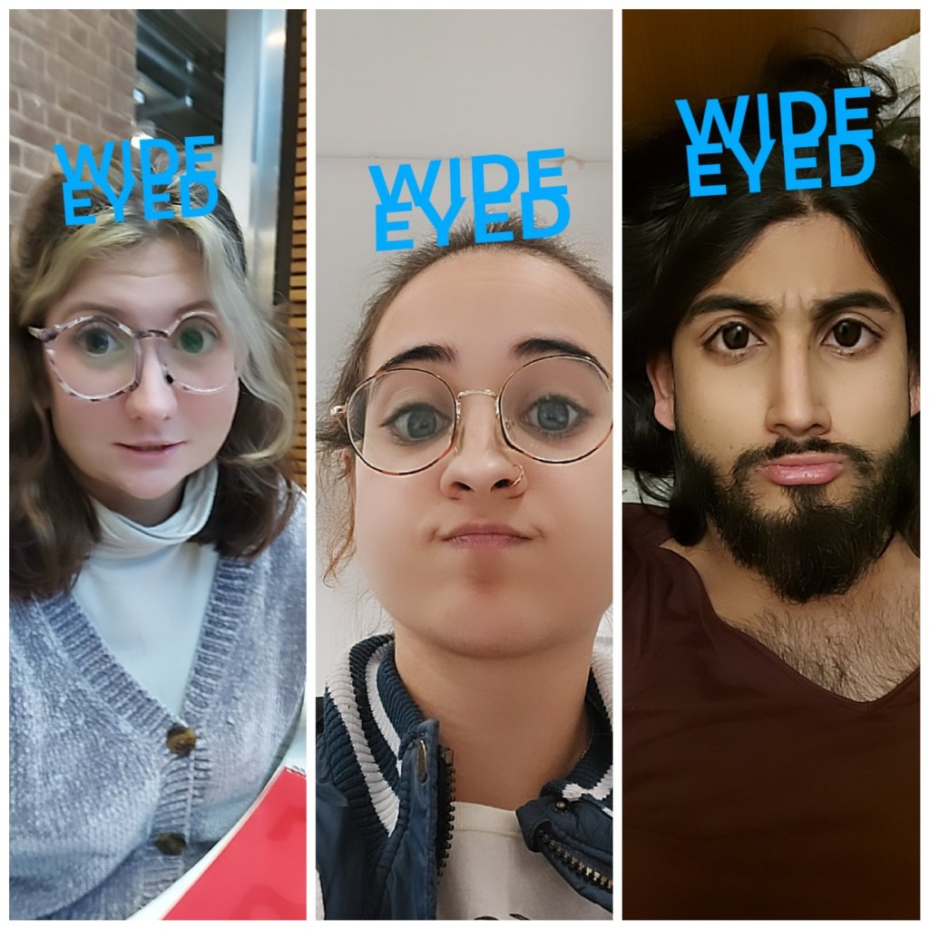
Now that I’ve completed the prototype, I knew that I wanted the rest of my outputs to be shown in the zine. So the first step was to create the least time consuming output that required the most research. An AR filter that makes any adults face look innocent and big eyed. But I must admit, I loved the process of making it! I’m embarrassed to admit that the big problem I was nervous about solving ( getting the filter to show reverse camera ) turned out to be nothing and that the filter shows reverse either way.
It took a day to create. I had to look through several YouTube tutorials until I found the right one. A lot of them only showed the face distortion option on Sparks ar, which didn’t allow me to make the eyes as wide as they needed to be, I also soon realised that I needed to make the whole face more innocent rather than just the eyes. Which meant I was looking to create a baby face filter. Luckily, that’s an option that’s been created several times on Sparks ar and I quickly found a tutorial video that showed me how to sculpt a face on a separate application that would export the face straight on to Spark ar with no hassle. The next step was to add a tap for music feature which was also very straightforward and easy to find a tutorial for. By then I’d already decided on a tune! “Mad World” by Tears For Fears, no song suited the campaign better.
All in all, the process was enjoyable, however the only part which became a struggle was creating a general baby face that looked cute and innocent without making myself look obese. Chubby cheeks became a blurred line and it took about 15 attempts of molding over and over again until I got it right. Thankyou snapchat for the fool proof references!

Although straightforward and entirely relevant to the project, the photography output for this campaign was the most frustrating and difficult part of this process. I get it when people in showbiz always advise to never work with children or animals. Due to such short notice ( coming up with good ideas too late ), I had to compromise with using two children instead of four, and one adult instead of two. This part of the outputs meant two separate shoots on different days. And my dedicated models consisted of my siblings and my mum.
The first major struggle with this was that it took a week to convince my mum to allow me to use my siblings for the planned photoshoot. She had no empathy for my vision and I had no empathy for her as a parent who didn’t feel comfortable with the topics I chose. It’s a challenge I’ve never faced before when using children to convey topics like Trafficking or FGM, but I suppose its difficult for mothers to see their kids posing a drug deal or a domestic fight. However with a few compromises being made such as using a toy pillbox instead of real tablets and a verbal agreement that involves me never using the photos on my socials and deleting them immediately after it’s intended purpose. I was happy to comply with this so long as I manage to get my work done in time.
The second struggle became evident when we began photographing outside. I managed to borrow a Canon camera from the loans room over the weekend which I learned how to operate thanks to a photography friend. The lighting was no issue, but the cold temperature was. Which meant I only had about three minutes per photograph until I had to get them inside. This became a much greater struggle during filming for the Manequin Challenge, it was virtually impossible to get a flawless shot without one of the kids blinking or moving due to the cameras flash in the dark and the cold weather. However thanks to heavy editing and a pair of extremely resilient young actors, I’m proud of the final outcome.

Now that the photography and the filter were complete. After a consultation, I was advised to use a riso printer. Since it was best suited to give the roughly printed 80s aesthetic that I wanted, and is able to print a large amount of prints in a very fast rate. And so when it came time to dedicate the next three days to riso; I learned that riso printing is a Japanese method of environmentally efficient print with soy based ink masters that get used one at a time so that nothing goes to waste. I knew that after taking an introduction course in the workshop, watching several YouTube videos on zine making using riso and a PowerPoint pdf about the steps to take before printing. I’d completely underestimated the amount of time and mistakes it takes to create a perfect riso zine with three colours and only gave myself four days to complete it before filming day. This honestly became the main mistake I made which resulted in my not using the riso print in the first place.
I’m glad I made a million mistakes throughout those few days such as not having enough paper ( I needed 15 at least), planning four colours instead of three for three workshop days, having my imagery placement in the wrong order for the zine, the imagery and text boxes not being placed on the right place so that the layers get printed on top of each other instead of out of place. And finally, I learned that its not possible to print different coloured layers on top of eachother without letting the previous layer seep through ( colours being transparent on top of eachother ). However even after spending £12 and learning all of these lessons, chances are I’ll never use a riso printer again. Not if I can help it anyways.

Overall I’d say I’m very pleased with how my zine turned out after using the digital media workshop again ( and this time thoroughly spell checking ). All the information that I wanted there had a place and in order. I would have given the background magazine print a light pink hue. Other than that, I love how the photographs look with the punk collage theme I went for and I think the zine truly conveys all the awareness I wanted to show in a powerful and visually pleasing way.
Before I knew it, it was the second day of filming. I this time wasn’t able to use a camera as I hadn’t enough time to learn how to use a flash whilst recording on the day. So I turned to my mums phone as I needed to use mine to show my working filter in the video, the recording as a result didn’t have a professional looking quality at all, however the Manequin Challenge itself in my opinion made the quality obsolete. I was glad that I’d finally got it done and in time to be able to submit my work despite my many professional and persoanl hurdles.
Once again, I’m in a grateful position where I’m thanking my trusty Android film editing app “YouCut” which helped me crop, edit and add features on to the video that can be seen today. It allowed me to easily shorten each of the clips which In the end consisted of 18 separate clips being placed together. Along with an easy ad on text and music feature.
In conclusion, I’m happy with my overall campaign. Even though I will proprably never use a riso printer again due to its very anti cost effective and time consuming nature. I don’t regret trying something new and out of my comfort zone. If anything, it strengthened my ability to think on my feet when things don’t go to plan! The Same goes for the rest of my outputs. It was a pure labour of love. I truly felt that for the first time in a while, I’d found a project that I felt was worth fighting and pursuing for.
